about contact surprise bookclub You can reach me at info@lanarih.com or stay in touch via my mailing list. All images © Lana Arih. Last update : October 2025.
À deux c’est mieux (better together)
A bathroom for an inseparable couple madly in love.
"We cook together, we sleep together, we eat together - we poop together.”


Double sinks are a commonly accepted bathroom feature in homes where couples live. Why stop at double sinks?
At the beginning of a relationship, a couple is made up of two individuals who, over time, become one. The initial promises and desires to hide certain parts of their lives from their partner slowly dissolve as cohabitation breaks down all walls.
The friends we had before are forgotten, "me and you" become "us", and every task and project becomes a group venture. The relationship becomes a priority, while privacy is slowly bid farewell.
Part of a series exploring values that shape the built environment.
Mirror view
Topshot of the bathroom
Mardi
Visual identity developed for Mardi architectes, an architecture agency based in Biarritz, France.


Primary logotype
Stencil
Secondary logo with tagline
Papers
Zyva studio
Zyva studio is a Paris based architecture and design studio. The goal was to develop a logotype that works well both in 2D and 3D applications.

Logotype animation
The Antivitruvian
house
Vitruvius declared that architecture must be solid, useful, and beautiful - values that have since become pillars of contemporary architecture.


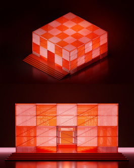
The antivitruvian house is neither useful, solid nor beautiful (in any conventional way at least). Instead, it emphasises non traditional (non Vitruvian) architectural values such as impermanence, play, total flexibility and uselessness, as a building may serve a multitude of functions outside of any traditional parameters.
View of the entrance
Screen displaying a graphic by B. Tschumi
Frontal view of the house
The screen displays a graphic from Bernard Tschumi (Advertisements for architecture, 1976) representing all kinds of uses buildings may serve.
Part of a series exploring values that shape the built environment.
Comet
Visual identity developed for Maxime Comet, a Biarritz based architect and carpenter.


To reflect the local character of Maxime's projects, the lettering draws inspiration from Basque typography.
The icon represents the celestial nature of the company's name while referencing the screw, an essential construction element.
Logotype and the icon
Logotype wood inlay green
Logotype wood inlay white
Acoustic comfort
Different types of comfort are key factors in determining the quality and safety of a given workplace. In the following example, priority is given to acoustic comfort.

Part of a series exploring values that shape the built environment.
Frontal view of the office
Print-a-tree
Christmas tree generating website developed in collaboration with Anže Petelinšek.

Users can create their own Christmas tree by dragging and dropping pre-made 3D Christmas decorations. By exporting and printing their own tree design they can replace a classic tree by a poster of their own making.

Website screenshot
Possible decorations
Modul-R
Temporary lightweight modular structure intended for autonomous construction.

Presentation graphic
Freelance designer based in Paris, working in the fields of spatial design, 3D and typography.


Better together
Better together
Mardi


Antivitruvian house
Antivitruvian house
Antivitruvian house


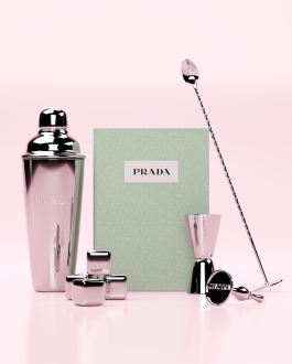
Prada Gifset
Prada Gifset
Acoustic comfort


Pile XP
Comet
Modul-R


Zyva studio
Scaffolding pavilion
Print-a-tree

Morph.love

